a purposeful rebrand, built to go the distance.
Scotland + Bates
What We Did:
Brand Workshop
Brand Architecture
Brand Strategy
Brand Identity
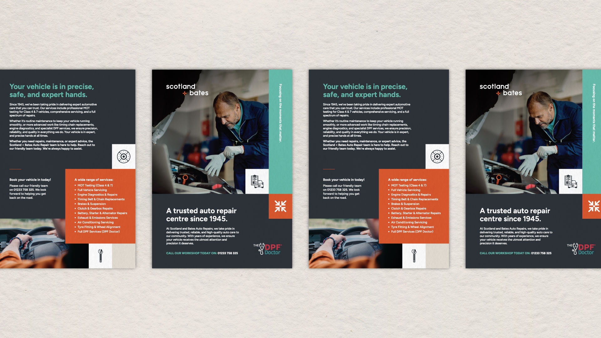
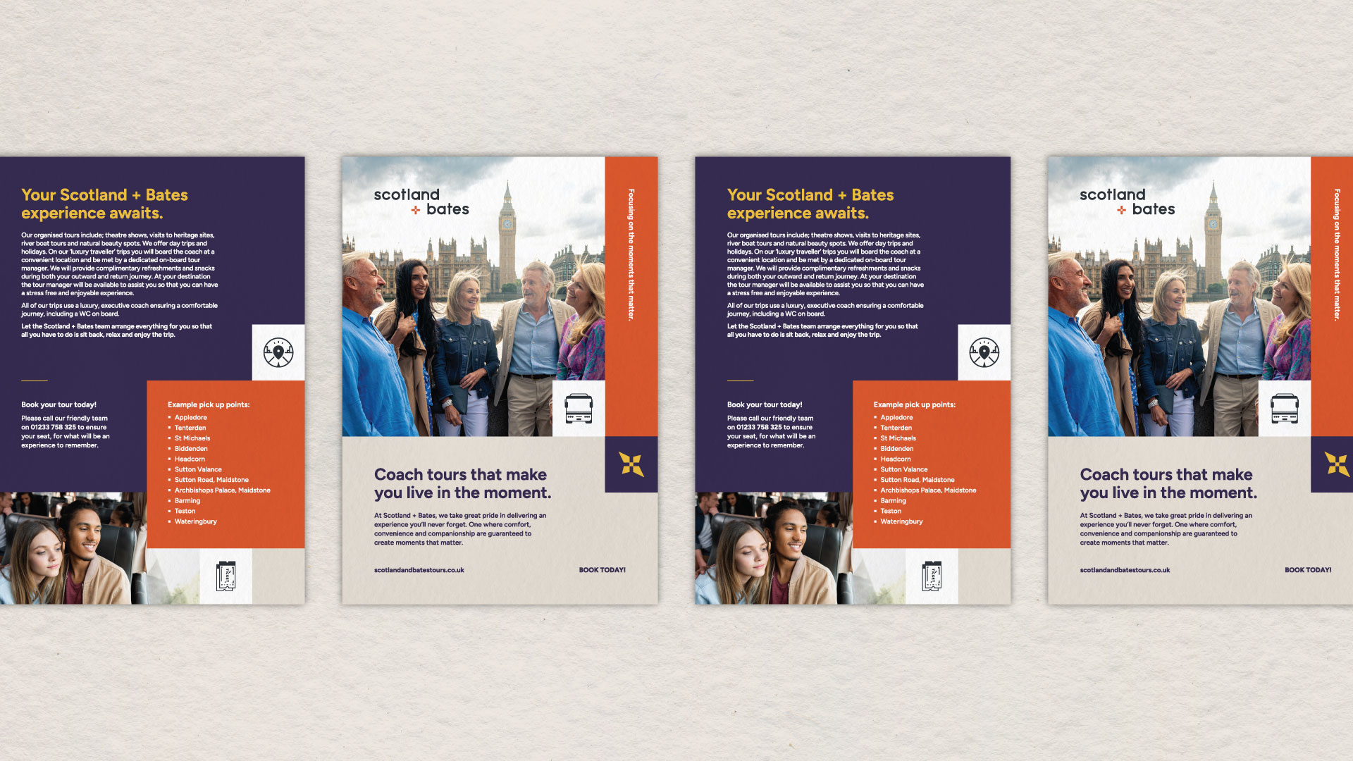
Print Design
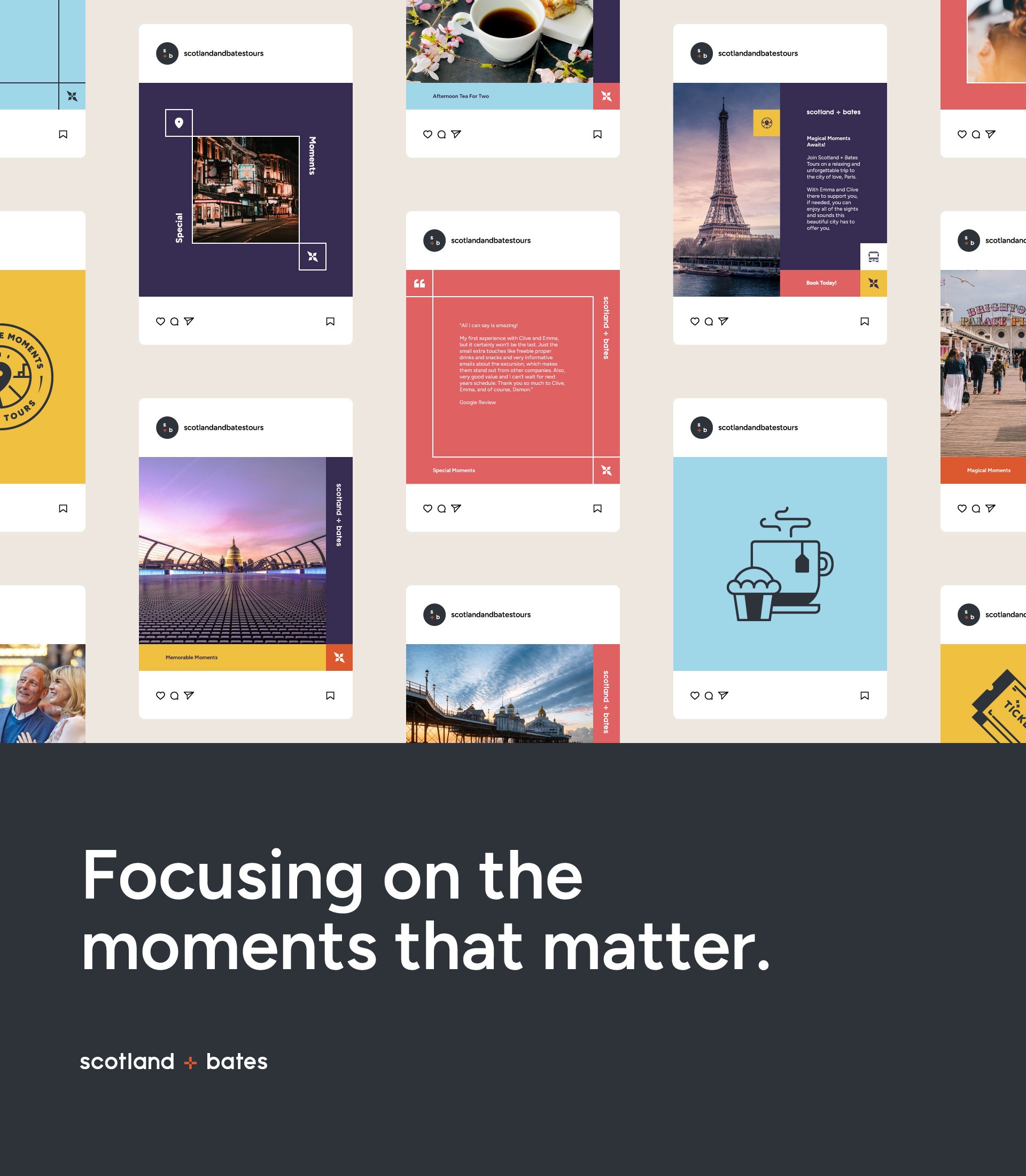
Visual Toollkit
Brand Guides
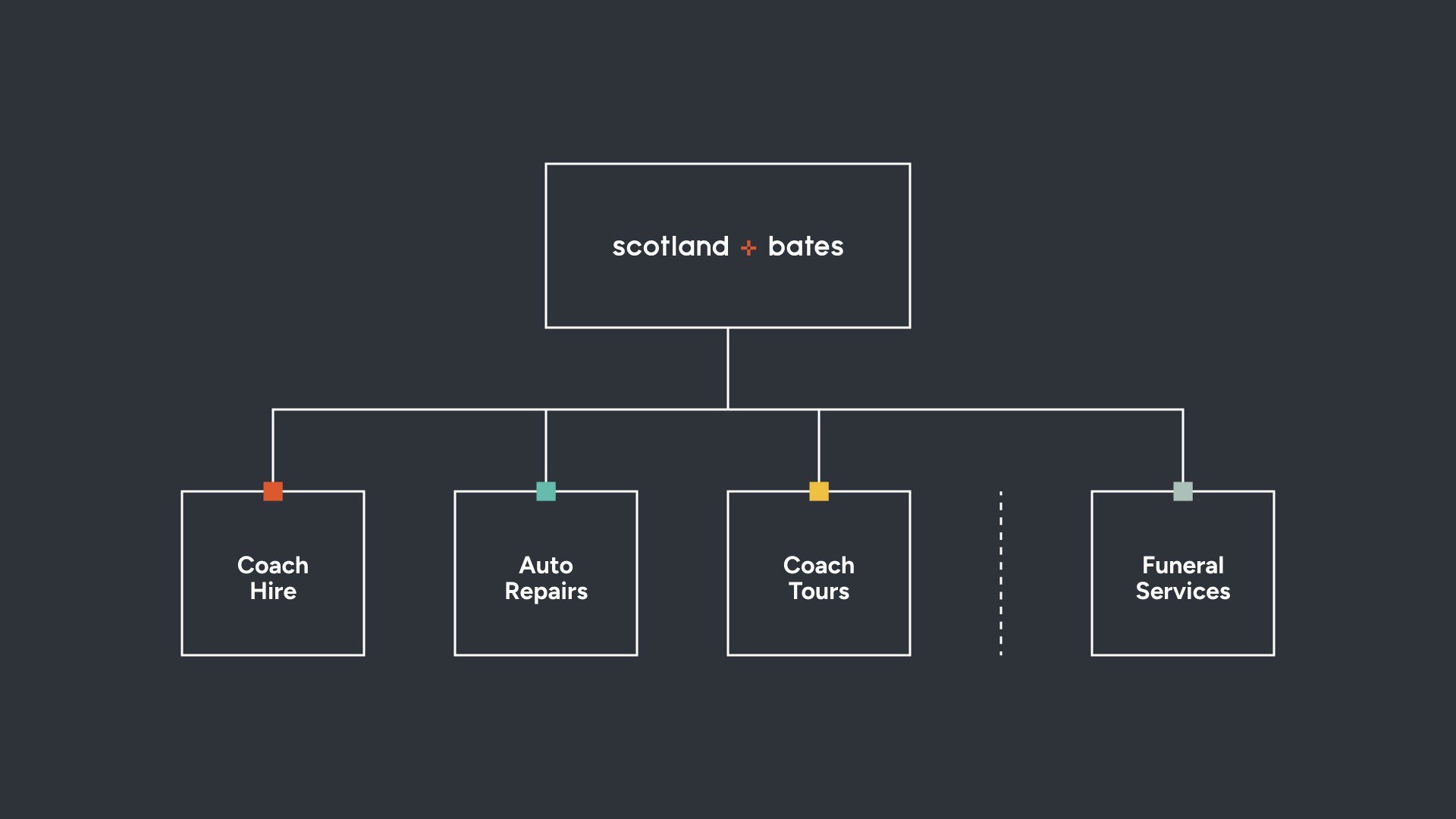
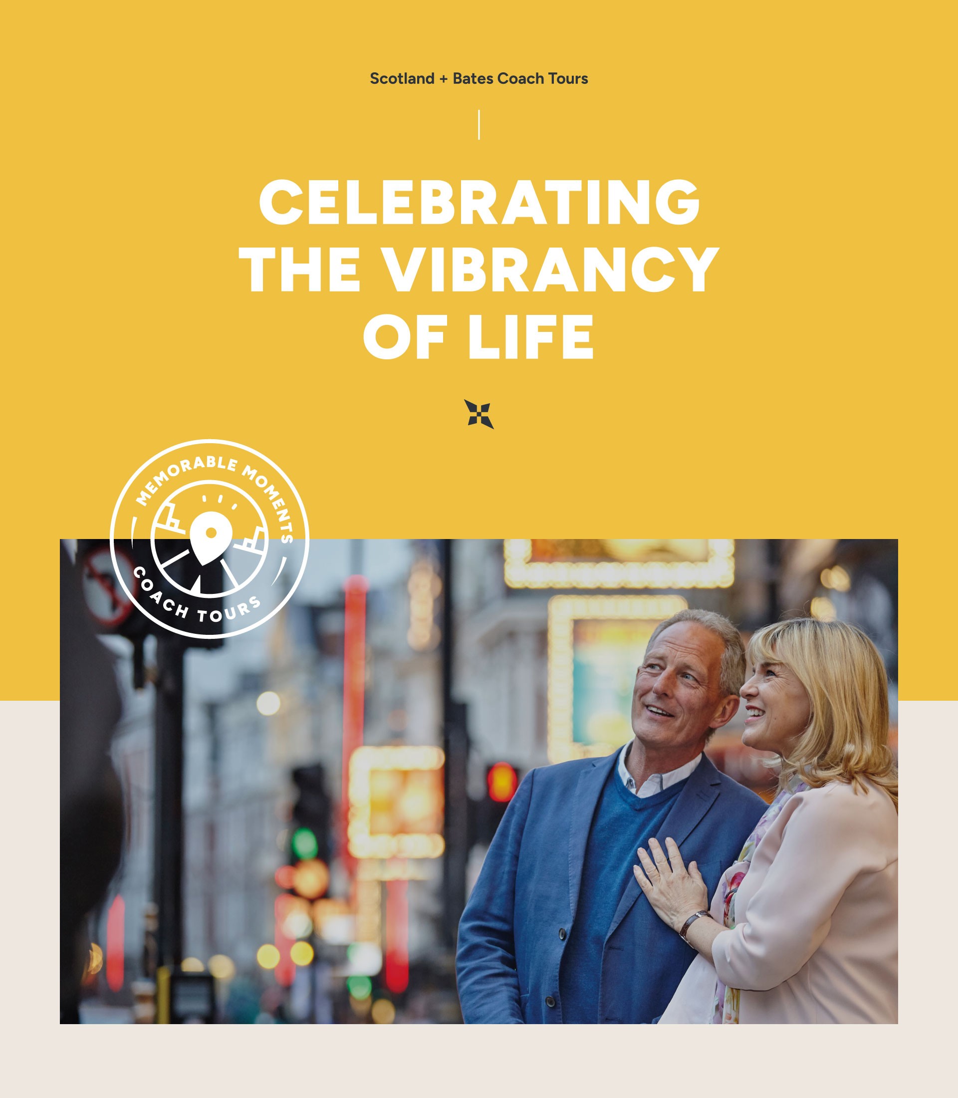
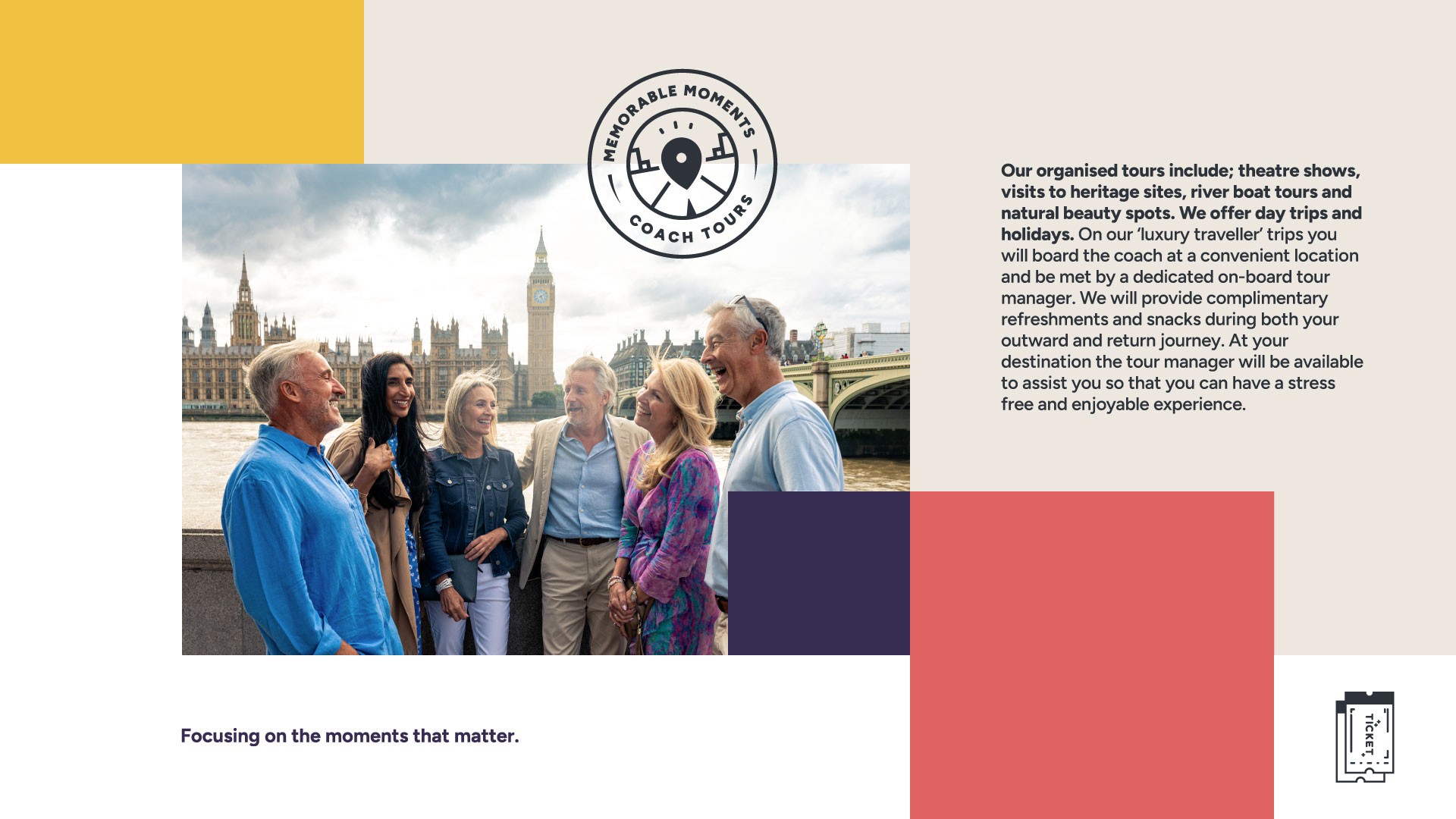
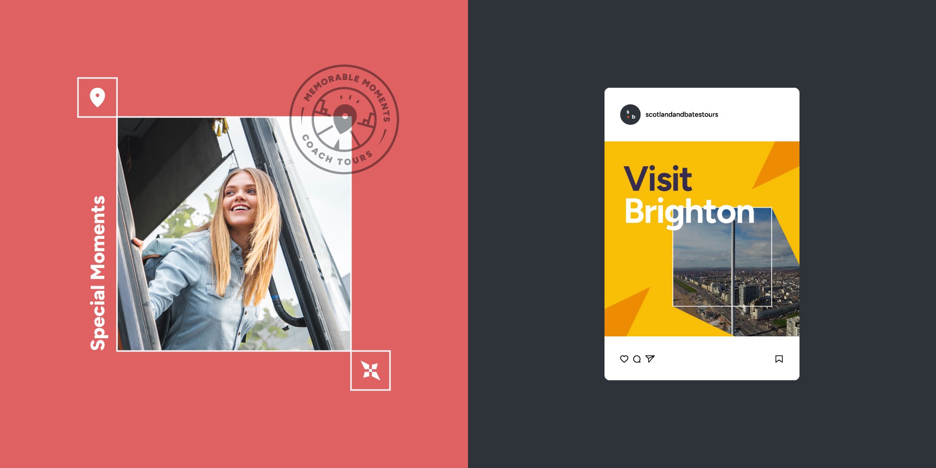
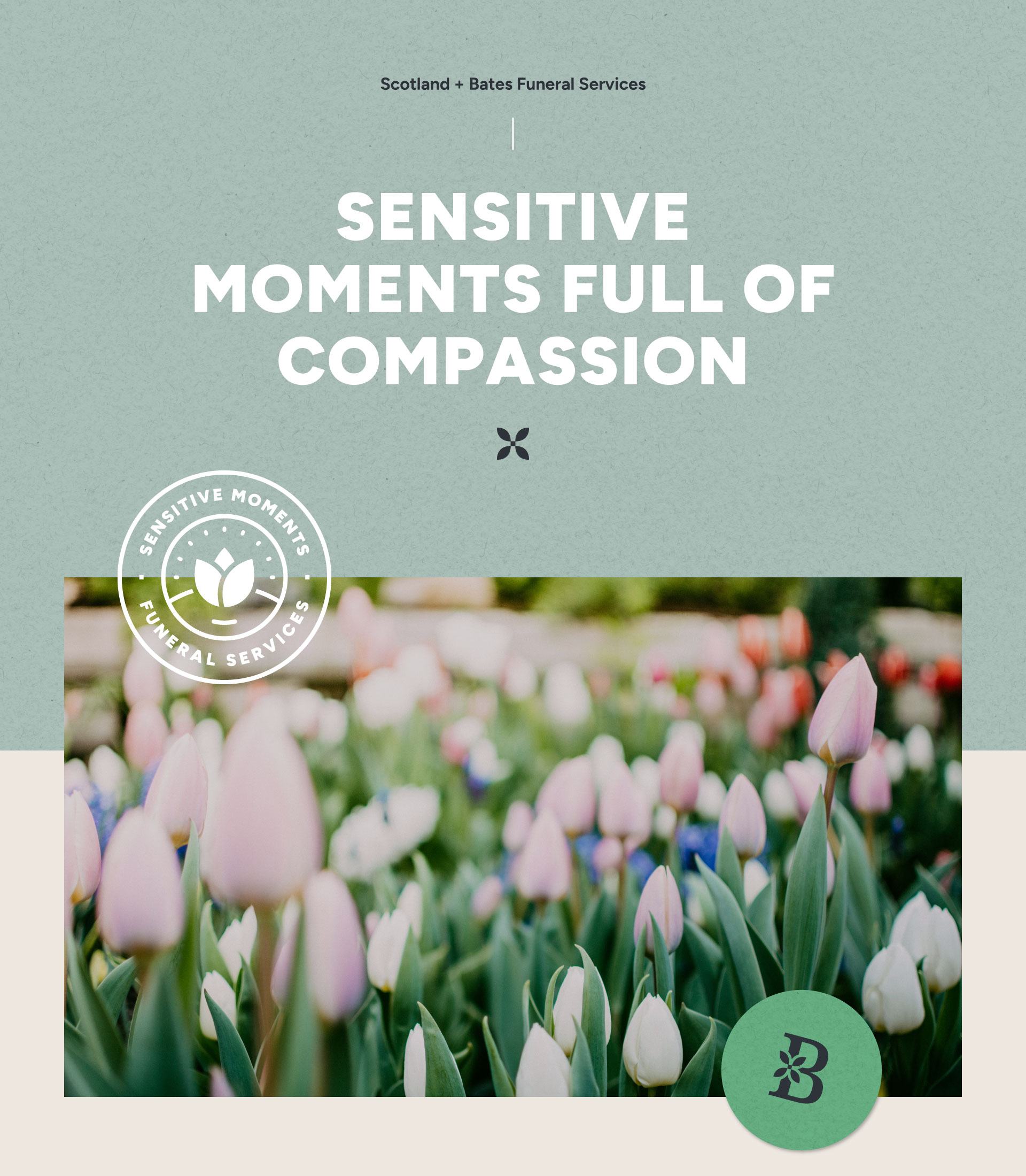
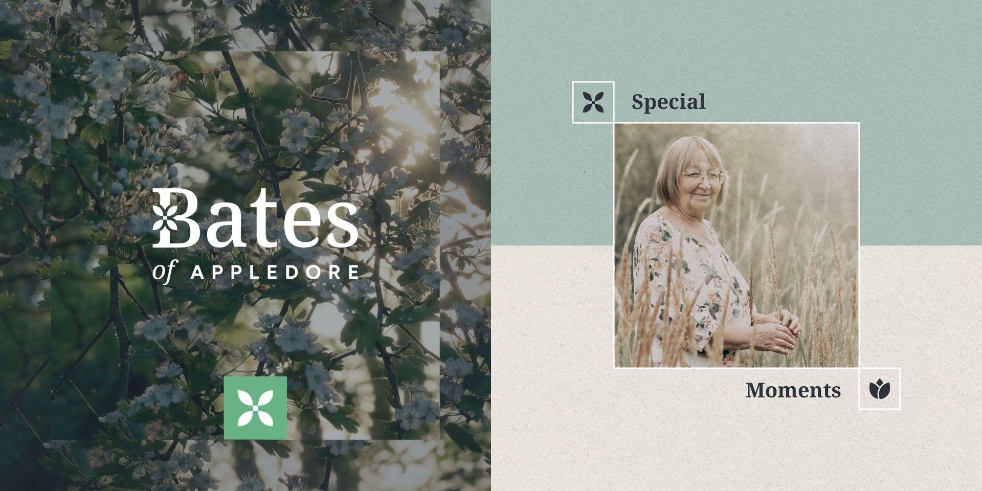
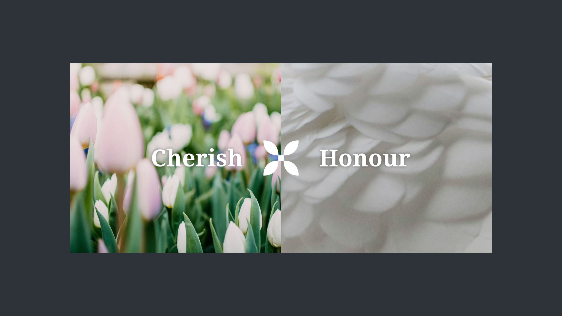
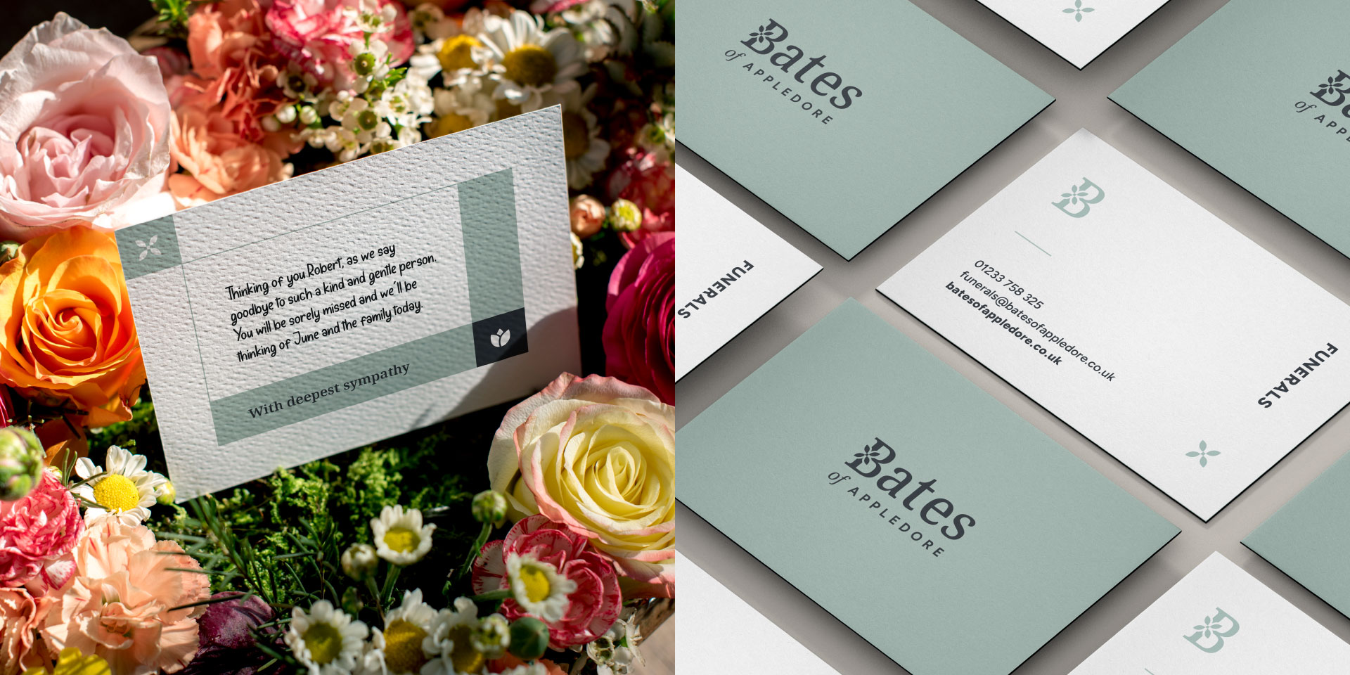
Scotland and Bates is a name that's trusted far and wide, and not just on the roads of Kent. But behind the scenes are four growing businesses, from coach travel to funeral services, with each going from strength-to-strength, but as a family of brands, each slightly out of sync. As the company geared up for the future, it was time to bring everything together under one clear, and confident brand. One that aligns the moving parts, honours the legacy, and one the drives all in the same direction.
Scotland + Bates
What We Did:
Brand Workshop
Brand Strategy
Brand Architecture
Brand Identity
Print Design
Visual Toolkit
Social Media
Brand Guides
Scotland and Bates is a name that's trusted far and wide, and not just on the roads of Kent. But behind the scenes are four growing businesses, from coach travel to funeral services, with each going from strength-to-strength, but as a family of brands, each slightly out of sync. As the company geared up for the future, it was time to bring everything together under one clear, and confident brand. One that aligns the moving parts, honours the legacy, and one the drives all in the same direction.
a purposeful rebrand, built to go the distance.
Scotland + Bates
What We Did:
Brand Workshop
Brand Architecture
Brand Strategy
Brand Identity
Print Design
Visual Toollkit
Brand Guides
Scotland and Bates is a name that's trusted far and wide, and not just on the roads of Kent. But behind the scenes are four growing businesses, from coach travel to funeral services, with each going from strength-to-strength, but as a family of brands, each slightly out of sync. As the company geared up for the future, it was time to bring everything together under one clear, and confident brand. One that aligns the moving parts, honours the legacy, and one the drives all in the same direction.
Scotland + Bates
What We Did:
Brand Workshop
Brand Strategy
Brand Architecture
Brand Identity
Print Design
Visual Toolkit
Social Media
Brand Guides
Scotland and Bates is a name that's trusted far and wide, and not just on the roads of Kent. But behind the scenes are four growing businesses, from coach travel to funeral services, with each going from strength-to-strength, but as a family of brands, each slightly out of sync. As the company geared up for the future, it was time to bring everything together under one clear, and confident brand. One that aligns the moving parts, honours the legacy, and one the drives all in the same direction.
The Brief:
With four varied, but growing service areas, each operating under the Scotland and Bates name, there was a need to bring a sense of unity to the brand. The challenge was clear! Create a forward-thinking design system that not only aligns these businesses cohesively but provides each with a sense of flexibility that allows them to grow and adapt with time. The brand needed to be practical, recognisable, and future-ready, ensuring every part of the business speaks the same visual language, wherever it shows up.

The Challenge:
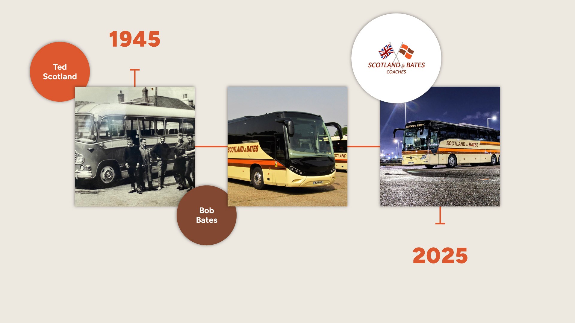
How do you unite Scotland and Bates' strong heritage, which has been loved by generations of the family, since 1945, with four growing, but diverse businesses under one clear brand. Each had its own story, its own audience, and if not considered carefully, could risk brand confusion. We needed to understand everything! The very start, the present, and the future, and create a platform to maximise their growth.
The Challenge:
How do you unite Scotland and Bates' strong heritage, which has been loved by generations of the family, since 1945, with four growing, but diverse businesses under one clear brand. Each had its own story, its own audience, and if not considered carefully, could risk brand confusion. We needed to understand everything! The very start, the present, and the future, and create a platform to maximise their growth.

The Result:
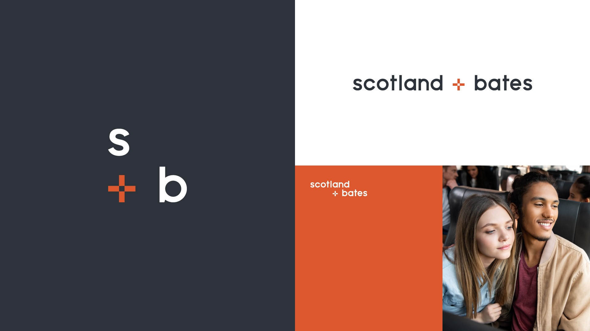
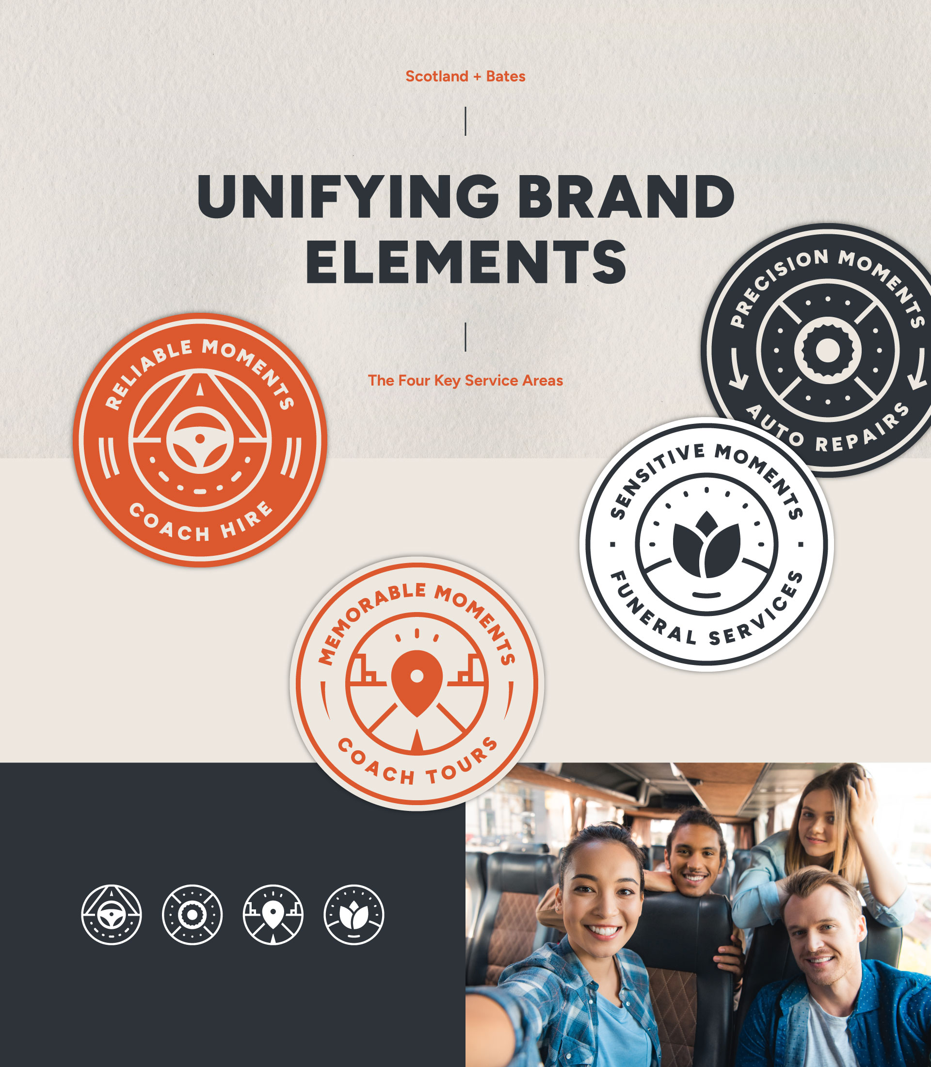
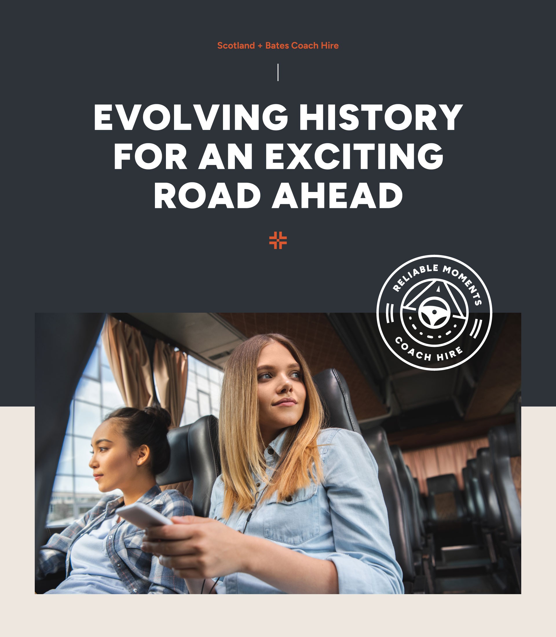
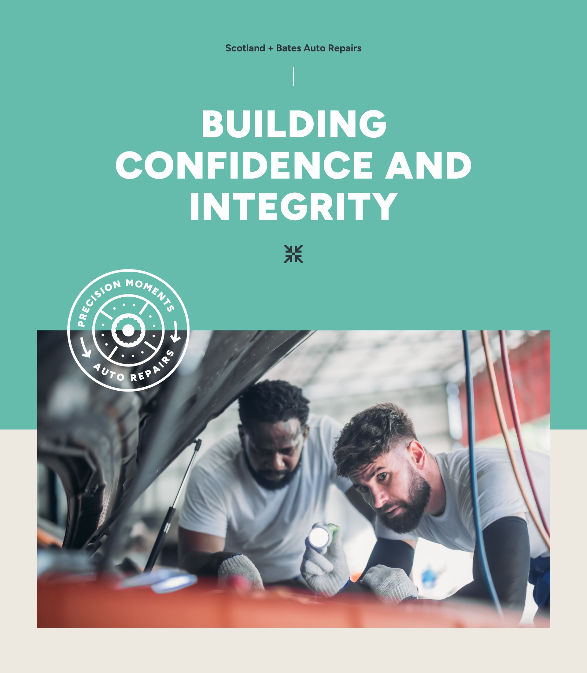
With a focused workshop, and thorough research being key attributes from the start, the result is a cohesive brand system that serves as a strong base for all four businesses to thrive on. Based on a sound understanding of the family’s history, legacy and ambition, the identity developed into a cohesive brand system, that drives distinction and uniqueness. The flexible design framework allows each business to shine independently, whilst remaining recognisable as part of the Scotland and Bates family of brands. Alongside this, a fresh brand narrative was established, and centred around the moments between points A and B, from precision and safety to comfort and memorable experiences. This narrative gives each business a platform to tell their story, helping them to connect emotionally with their diverse audiences, whilst reinforcing their shared values.
The Result:
With a focused workshop, and thorough research being key attributes from the start, the result is a cohesive brand system that serves as a strong base for all four businesses to thrive on. Based on a sound understanding of the family’s history, legacy and ambition, the identity developed into a cohesive brand system, that drives distinction and uniqueness. The flexible design framework allows each business to shine independently, whilst remaining recognisable as part of the Scotland and Bates family of brands. Alongside this, a fresh brand narrative was established, and centred around the moments between points A and B, from precision and safety to comfort and memorable experiences. This narrative gives each business a platform to tell their story, helping them to connect emotionally with their diverse audiences, whilst reinforcing their shared values.


What The Client Said:
"Dan and Matt have been an absolute pleasure to work with. We approached them with a tricky brief, four distinct businesses that all needed to feel unified under one brand, and a very outdated identity in need of a complete overhaul. TYO did not disappoint. We are genuinely thrilled with the final result and can’t wait to roll it out. The branding is now clear, modern, and full of meaning. Dan and Matt went above and beyond throughout the process. We’ll continue to use them for all our branding needs, and I’d wholeheartedly recommend them to anyone."
Emma Bates, Director


With Thanks:
A huge thank you to the whole Scotland + Bates family, especially Clive and Emma. A brand process that was 'done right' from the very start. Incorporating valued insights and experience from so many people within the business, which resulted in a well considered, and truly rounded brand experience. One that looks to create success for the road ahead.
more projects
You Might Also Like.
Check out some of our other creative collaborations, which include a range of branding, design, and digital projects. Discover how we're giving brands more.
more projects
We Believe In More
Check out some of our other creative collaborations, which include a range of branding, design, and digital projects. Discover how we're giving brands more.
solley's ice cream
A new strategy and visual identity developed to bring this Kentish icon to life. It's much more than just ice cream!
Strategy
Branding
Packaging
solley's ice cream
A new strategy and visual identity developed to bring this Kentish icon to life. It's much more than just ice cream!
Strategy
Branding
Packaging
riverdale global
An industry challenging, and bold rebrand launched at NPE 2024 - resulting in a 450% increase in leads.
Strategy
Branding
Exhibition
riverdale global
An industry challenging, and bold rebrand launched at NPE 2024 - resulting in a 450% increase in leads.
Strategy
Branding
Exhibition
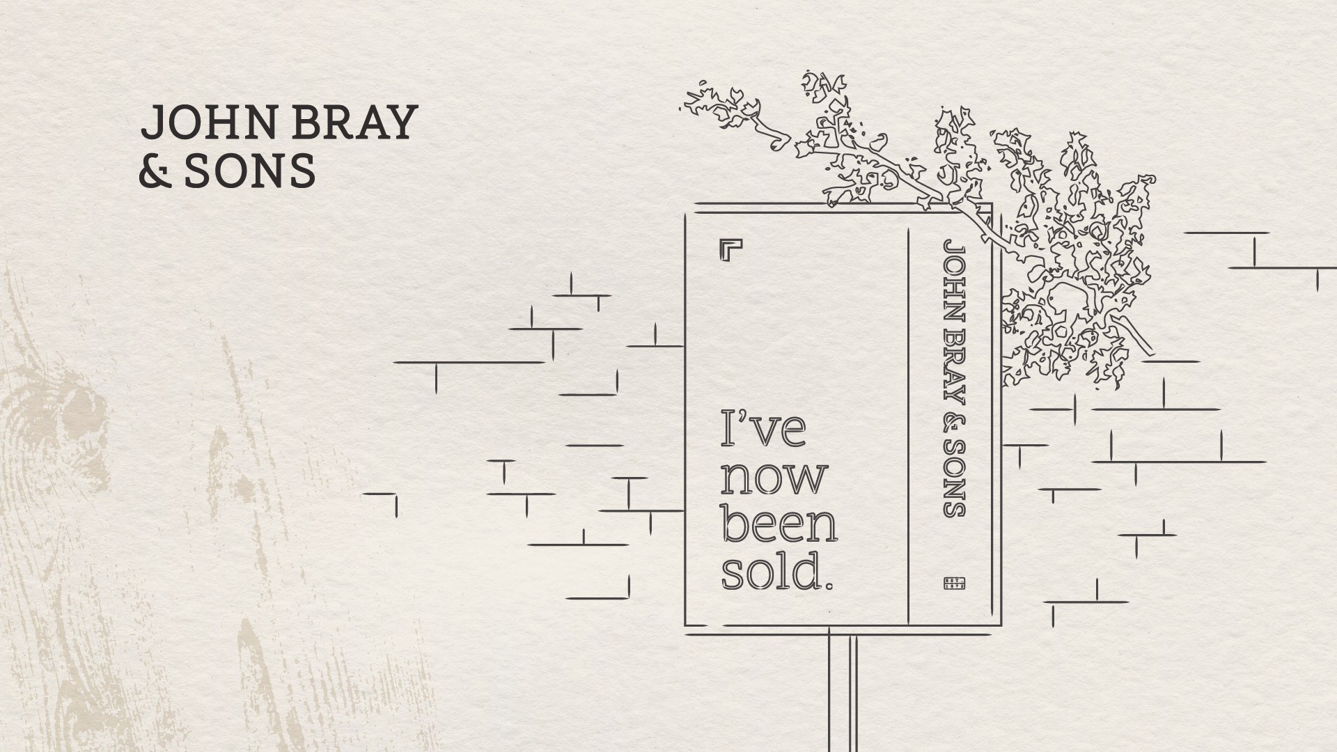
john bray & sons
A timeless brand celebrating 150 years of heritage, location, and trusted quality. Modernised for today’s market.
Strategy
Branding
Digital
john bray & sons
A timeless brand celebrating 150 years of heritage, location, and trusted quality. Modernised for today’s market.
Strategy
Branding
Digital